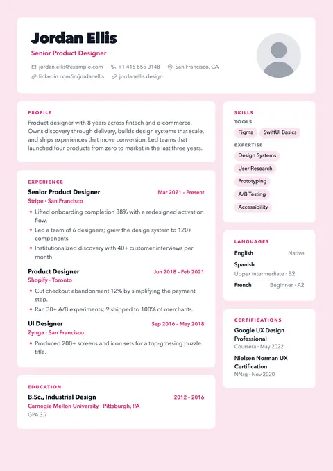
Tinted page with white cards for every section.
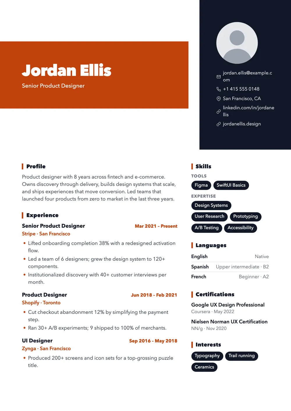
Oversized name on a color block. Made to be noticed.
Bold is made to be noticed: your name in oversized, extra-heavy letters on a burnt-orange block, beside a tall near-black panel with your photo and contact details. Below the header, the page calms down into two white columns with dark skill chips.
Free · no sign-up · PDF download
It suits creative and commercial roles where confidence is part of the job: brand and graphic designers, art directors, creative producers, content leads, agency and event staff. Use it when a person sees it first, such as an email to a studio or a referral.
The orange block fills about two thirds of the header width and sets your name at roughly three times body size. The dark panel starts at the very top of the page and stacks an optional round photo above contact lines. Section titles are bold, in sentence case; dates and employers appear in orange.
Bold is visual-first, and the editor's check for applicant tracking systems (ATS) flags it as such. The text is real, but your email and phone sit apart in a dark block and the body is split in two, so an ATS may misplace them. For large portals, switch to a single-column template; your content stays.
Tinted page with white cards for every section.
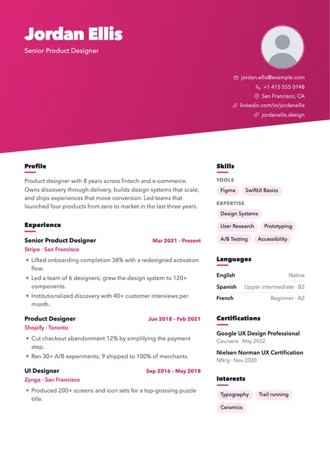
Diagonal gradient header for portfolios and creative roles.
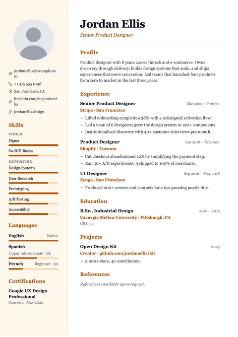
Warm serif with a tinted sidebar and level bars.
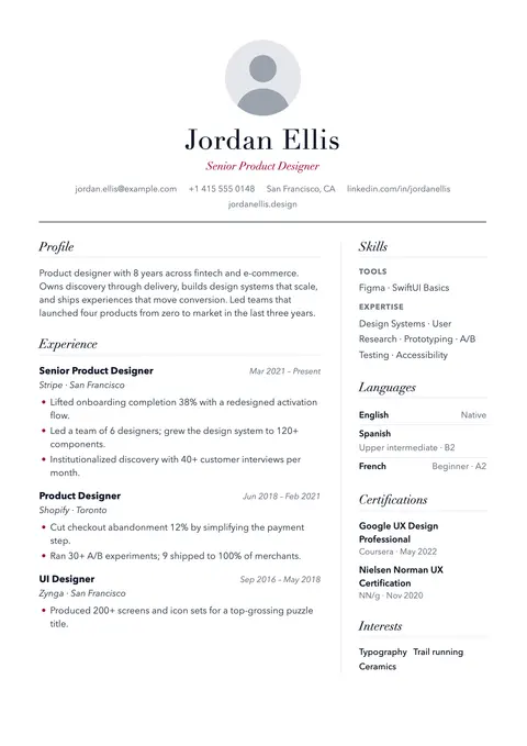
Editorial serif with a centered masthead.