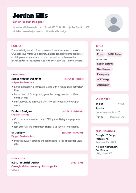
Tinted page with white cards for every section.
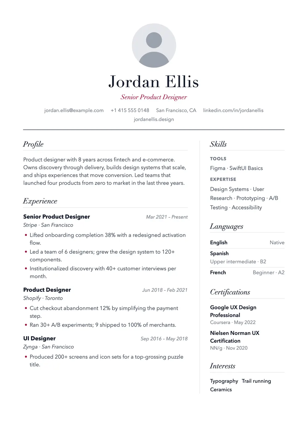
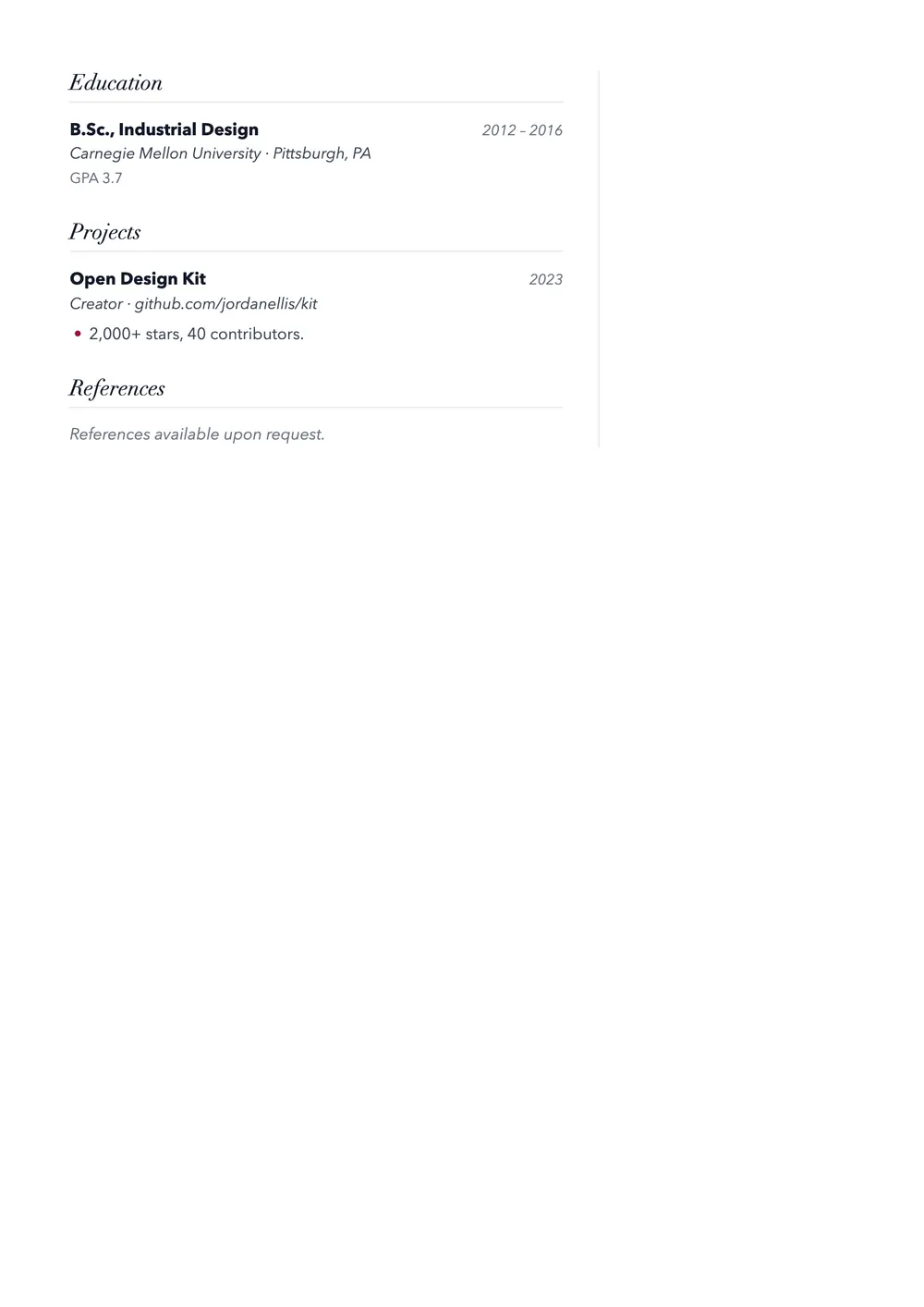
Editorial serif with a centered masthead.
Verse takes its cues from magazine design. A centered masthead sets your name in a high-contrast, Didot-style serif, with an italic headline in deep crimson and a fine black rule beneath. Below, two columns and italic serif section titles read like a well-edited page.
Free · no sign-up · PDF download
It suits people who work with words and taste: writers, editors, journalists, copywriters, PR specialists, and roles in publishing, museums, architecture or fashion. Designers who prefer restraint to color blocks will like it too; the masthead stays balanced without a photo.
An optional round photo sits centered above your name, with contact details centered below and no icons unless you switch them on. A thin vertical line sets off the right column. Section titles are italic and in sentence case over a hairline; employers and dates are italic too, and bullets are small crimson dots.
With no color blocks and a plain text masthead, Verse is gentler on parsers than most creative templates, and inline skills give applicant tracking systems (ATS) simple words. Still, some systems may jumble the right column, so mention key skills in your experience or use a single-column template.
Tinted page with white cards for every section.
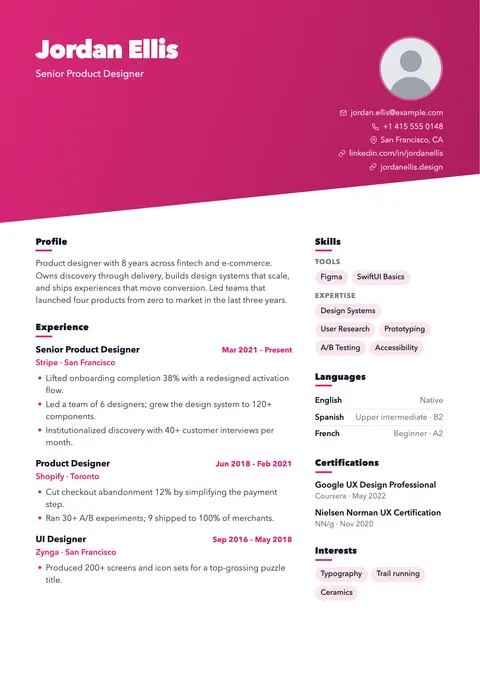
Diagonal gradient header for portfolios and creative roles.
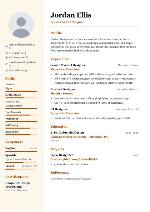
Warm serif with a tinted sidebar and level bars.
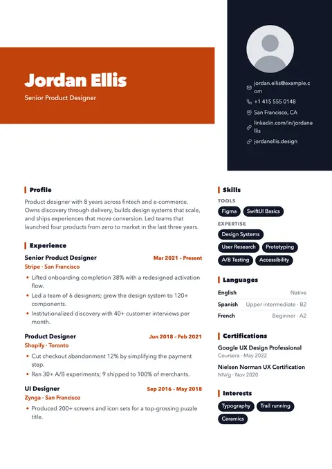
Oversized name on a color block. Made to be noticed.