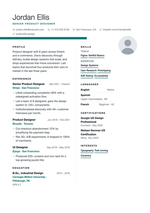
Light name, ribbon rule bleeding off the margin, generous white space.
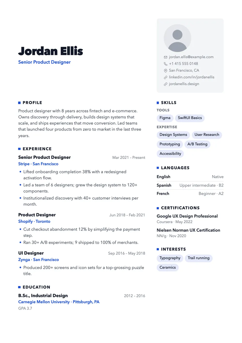
Big name, contact card on the right, square section markers.
Capital puts your name front and center, set very large in an extra-bold geometric typeface with your headline in the accent color below. Beside it, a light gray card with rounded corners holds your photo and contact details.
Free · no sign-up · PDF download
It suits people whose name should stick: sales and business development leads, consultants, account directors, finance and real estate professionals, founders and freelancers who pitch to clients. With no dark color blocks, it also prints cleanly in black and white.
Inside the card, the photo sits on top, with email, phone, location and links listed beneath it. Below the header, the left column carries profile, experience, education and projects; the right column, a little over a quarter of the width, lists skills as chips, languages, certifications and interests. Section titles are bold capitals led by a small accent square.
Your name comes first and your contact details follow as real text, which suits applicant tracking systems (ATS). Below, some systems read the two columns out of order, and a few skip the side column. Mention core skills in your experience bullets too; for high-volume portals, a single-column template is safer.
Light name, ribbon rule bleeding off the margin, generous white space.
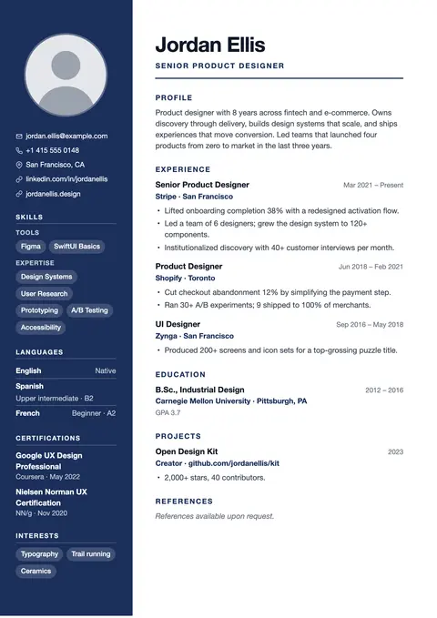
Dark sidebar, strong hierarchy. The corporate classic.
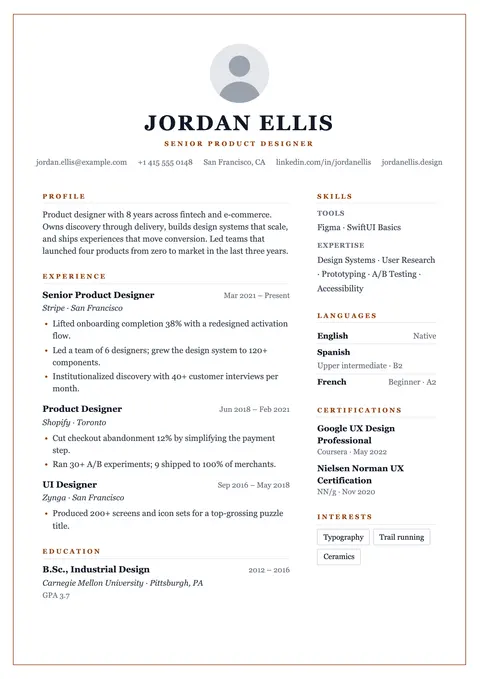
Thin accent border around every page, centered classic header.
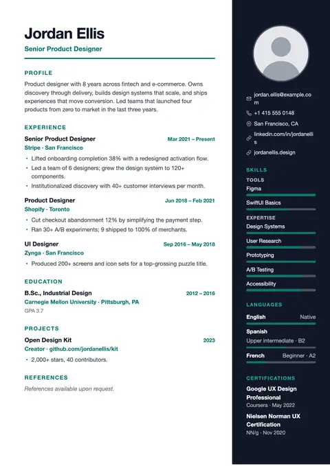
Charcoal right panel with photo and skill bars.